Team: 1 person
Duration: 2–3 weeks
Category: Data & Visualization
Created:
Tech Stack
R Shiny Leaflet ggplot2 ggiraph dplyr sf rnaturalearth
Tags
R Shiny Data Visualization
🌍 World Happiness Visualization
R project analyzing and visualizing World Happiness Report data from 2013 to 2023.
Project Gallery

+1
View all
Why it Matters#
Happiness data is often presented as static rankings. This project turns the World Happiness Report into an interactive explorer so users can answer richer questions: How does a country change over time? How do regions compare? Which indicators move together? The app prioritizes clarity, visual hierarchy, and accessibility with coordinated views and minimal chart junk.
What You Can Explore#
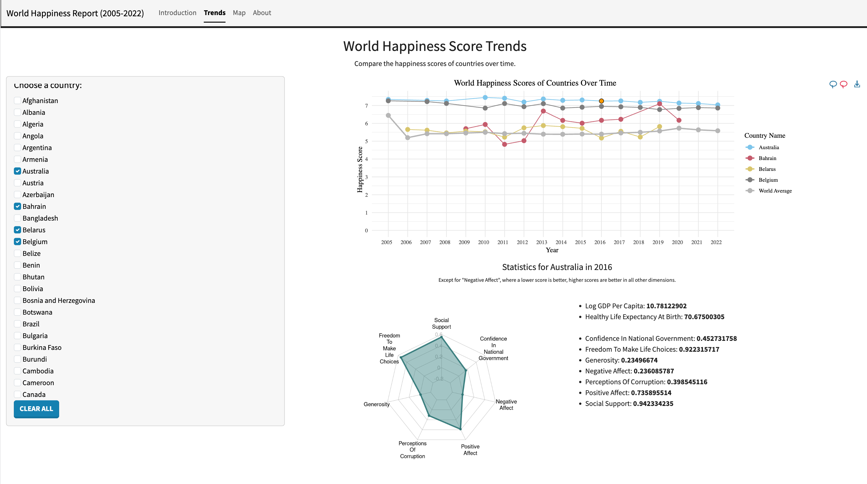
Trends (Time)#
- Compare happiness scores across countries from 2005–2022.
- Interactive tooltips show exact values; a world average line provides context.
- Click a point to reveal deeper country statistics for that year.
Country Profile (Indicators)·#
- A radar chart summarizes multiple normalized indicators (strengths vs weaknesses).
- Detailed metrics appear beside the chart for quick reading.
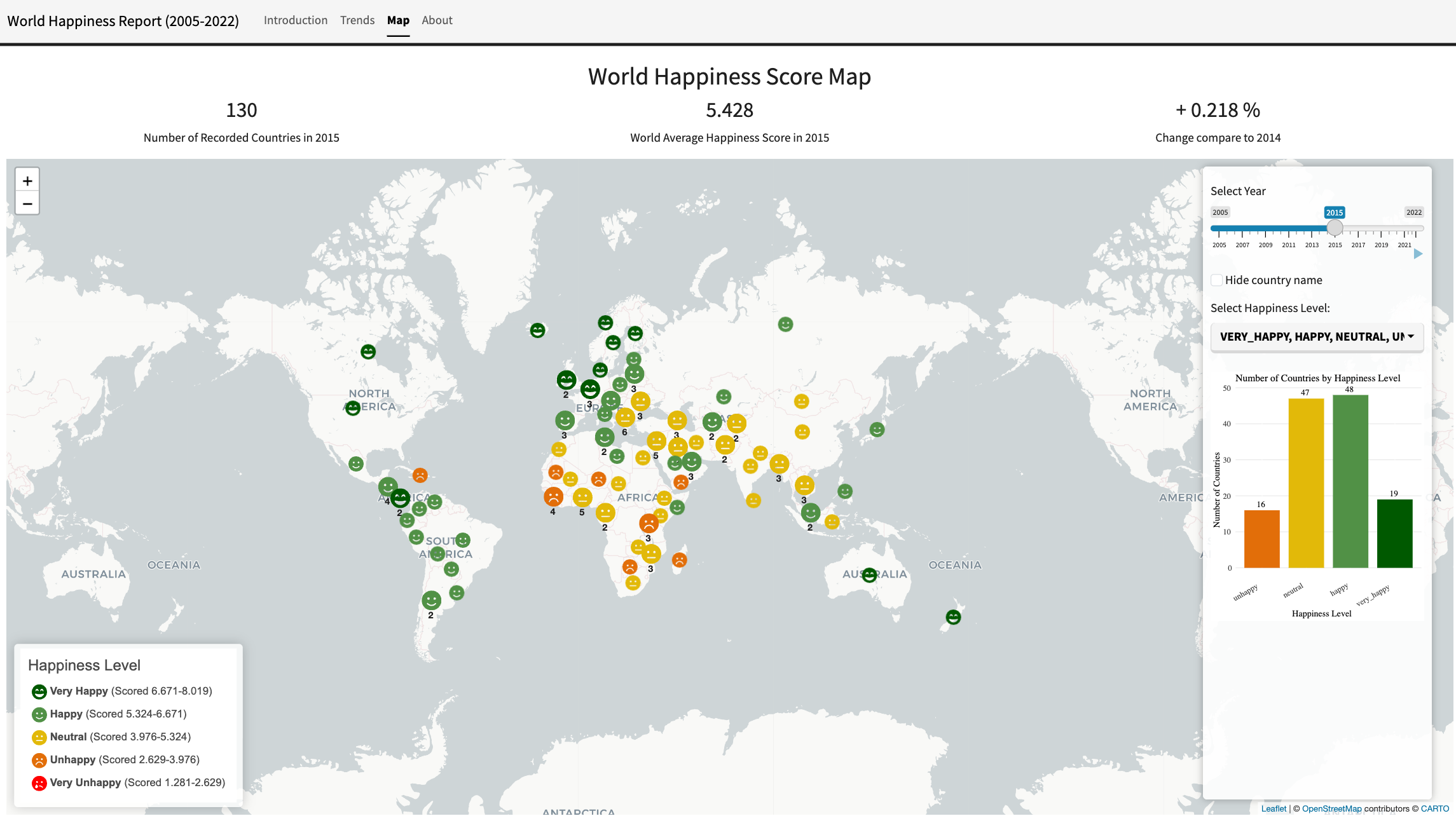
Map (Space)#
- Explore global happiness distribution by year with a timeline slider.
- Filter by happiness level and optionally hide country labels to reduce overlap.
- Clustered markers improve density and readability at global zoom.
Data & Sources#
- World Happiness Report: https://worldhappiness.report/ ↗
- Dataset (Kaggle): https://www.kaggle.com/datasets/usamabuttar/world-happiness-report-2005-present ↗
- Icons: Font Awesome (free): https://fontawesome.com/search?q=face&o=r&m=free ↗
- Map tiles: CartoDB Positron (via Leaflet providers)
Technical Implementation#
- Framework: R Shiny, deployed to shinyapps.io.
- Spatial stack:
sf+rnaturalearthfor country geometries; centroids computed for marker placement. - Mapping:
leafletwith custom SVG marker icons and cluster behavior. - Charts:
ggplot2+ggiraphfor interactive time-series;fmsbfor radar charts. - Data wrangling:
dplyrfor filtering, joins, and aggregation. - Reproducibility note: world geometry is pre-generated (
worldMap.rds) to avoid deprecated GIS dependencies and runtime downloads on hosting.
Key Notes#
- Threshold-based happiness classes (very unhappy → very happy) are derived from the score range to keep the map legend consistent across years.
- UI choices emphasize readability: light basemap, limited UI colors, and interactive details-on-demand (tooltips instead of labels).